Logo competition Winner and new Paragon logo announced
Paragon's logo competition submissions has been closed for a couple of days, and we have kept you waiting for our decision on the winner. Sorry. We have finally made up our minds, and believe me, it was a process that took three votes, public discussion between our members and other hazzle. It definitely wasn't easy or fast.
In addition to the public competition, we also had some logo suggestions from outside the competition. We then lined these up with the competition suggestions to find the best possible new logo for our guild.
The new logo ended up being from outside the competition, so we decided to award our favourite public competition entry with the promised free SteelSeries product, even though we didn't end up using it.
The favorite and winner of the free SteelSeries product is Justin Lau. Congratulations! Below you can see his suggestion for a new Paragon logo.
Many participants wanted to get some feedback from their work, but as we got almost 40 suggestions we couldn't answer all of these emails. We'd now want to say a few words collectively to all the artists who put their time into helping us.
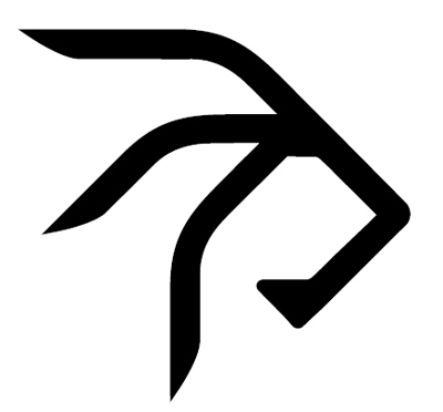
As we said in the original news post, we wanted the logo to be strongly shape driven. The shape should be able to stand by itself and still remind the viewer of us. Also, we wanted simple shapes, suitable for printing, and out of the box thinking.
Again, we'd like to thank everybody who participated in the competition. It was very generous of you, and we appreciate the hard work and inspiration everyone put into this.
In the process we also found ourselves a new logo concept, made by Simeone Sergio Spagnoli. We'll try to reach the artist later to answer a few interview questions about how the logo was born.
We'll gradually start using the new logo as well as prepare downloadable images for the media as we finalize the concept.
Below you can see Paragon's new logo concept.
Tags:
- Log in to post comments
Comments
Congratulations to Justin and Simeone, as well as all those who participated. New logo sure looks good!
Wed, 30/03/2011 - 22:14
Not a stupid fanboy or smth, but couldnt not to mention? that it looks MUCH like the Ensidia logo =//// ???
Wed, 30/03/2011 - 22:32
No it doesn't.
Wed, 30/03/2011 - 22:39
I like it good work :)
Wed, 30/03/2011 - 22:54
Very nice! I really like the "g" too.
Congrats to the winners. :)
Thu, 31/03/2011 - 08:06
Those 3x fingers look like the 1/2 part of Ensidia logo for sure, eoy.
http://filebase.manaflask.com/images/news/ensidia-avatar.png
I like both logo-s, and specially the idea.
Thu, 31/03/2011 - 09:42
It is supposed to be a lion head, and I don't see a lot of resemblance to the Ensidia logo there tbh.
Thu, 31/03/2011 - 10:50
First of all i see the OK symbol here =))
http://thumbs.dreamstime.com/thumblarge_365/1234457699NReJvq.jpg
Thu, 31/03/2011 - 10:53
I really love it that people see so many different things in it. Myself I see a lion or a deer (or something with antlers) or an "evil hand with crooked fingers. And of course the letter P.
Thu, 31/03/2011 - 11:19
its really a new generation headcrab attacking from ceiling.
Thu, 31/03/2011 - 12:19
CRAB BATTLE! https://www.youtube.com/watch?v=8mHKHKR8x6A
Thu, 31/03/2011 - 12:22
wth is ppl talking about, its clearly a bicep with massive main blood vessel on it?!
Thu, 31/03/2011 - 14:49
http://data.fuskbugg.se/skalman02/paralolgo.png
*rolleyes*
Thu, 31/03/2011 - 15:08
eoy, if I remember correctly you played a key-role in the design of Ensidia and manaflask websites. Did you design the Endisia logo currently in use? Because if so, your statement would have even more weight.
Thu, 31/03/2011 - 16:19
We plan to tell how the shape was formed etc in the interview with the artist who designed the logo. Stay tuned for that.
Thu, 31/03/2011 - 16:16
The Ensidia logo was designed by Hams and me yes.
To prove my point (and that I am eoy), here are some of the unused concepts we had for the Ensidia logo:
http://imageshack.dk/imagesfree/nMn02203.jpg
http://imageshack.dk/imagesfree/gX002222.jpg
Our process went something like that we were looking at fonts, and then we found one that had an E that I thought was shaped like a dragon / batwing, so I figured we should work the logo around that and traced + improved the E in Illustrator to feel even more dragony. After a lot of struggle (the pictures above for example) Hams finally came up with the idea of turning it on the side, and the Ensidia logo was born :)
Don't mind the shield, it was just put there to give the logo some context. And no, I don't think Paragon's new logo looks the same as Ensidia's. If anything, the logo made me think of this: http://imageshack.dk/imagesfree/tYy01094.jpg but that's just my twisted mind at work.
edit: or this... http://imageshack.dk/imagesfree/MVL04075.jpg
edit: and it is now a lion: http://imageshack.dk/imagesfree/Wfy15067.jpg or something strange with balls.
edit: actually it shows Paragon (illustrated by a black guy because of the symbolic meaning of the dark winters in Finland) beating USA (symbolized by the typical American eagle). There. Can stop discussing this now. http://imageshack.dk/imagesfree/hoS15797.jpg
edit: nvm it's a rastafari monkey http://imageshack.dk/imagesfree/0GB16515.jpg
Thu, 31/03/2011 - 23:58
This is how I feel the new logo is so good and why it fits Paragon as a guild and Finnish culture.
Look at the city layout for Rovaniemi, Finland. The city has the shape of a reindeer. Valtatie being the line for the top of the head and the body line. The edge of the land that borders the water being the "bottom" line for the head and body. Then you see these beautiful horns coming from the streets.
This new logo does not look like a lion at all, but rather a reindeer in a offensive/powerful position. I know that Finland coat of arms symbol is a lion in rampant position, however I really feel that this logo is more of a reindeer than it is a lion. If you remove the triangular tip on the lower line (denoted in my drawing by the red circle) and move that to where the black circle is then I believe that Paragon would have an exquisite logo.
http://img5.imageshack.us/i/lionentry.jpg/
The logo reminds me a lot of Kuusamo coat of arms.
I feel that historically the reindeer has much for meaning to Finn's than the lion does. I do not see Ensidia's logo at all in this design.
I acknowledge the symbolic power of the lion, but I just feel that for a country and language as unique as Finland that the reindeer is a better and more powerful symbol.
Thu, 31/03/2011 - 21:52
OMG. It's all a conspiracy: http://imageshack.dk/imagesfree/EFi05411.jpg
Thu, 31/03/2011 - 23:10
http://img855.imageshack.us/i/reindeer.jpg/
I like the P and A in this design. I do have a plain black one if you prefer. I assume you are still looking for logo since you said the one in your post is a concept.
Thu, 31/03/2011 - 23:52
Snake? SNAAAAAAKEEEEEEEE!!!
Fri, 01/04/2011 - 00:54